Pantone has announced its Colour of the Year for 2019: Living Coral. It is a bold and bright peachy, golden orange designed to shock the senses and make a statement. It is also a colour that would send most people running because not easy to incorporate in the home. It has a tendency to dominate which is why our interior designers are here to give some easy tips on how to use this “animating and life-affirming coral hue.”
Bursts of colour
The temptation with such a vibrant shade is to pair it with equally vibrant shades. On the Pantone press release itself, the coral is shown against a beautiful turquoise sea. The pairing is refreshing and energising but a colour scheme with bold swathes of these colours would be overpowering and date quickly. Our interior designers’ top tip is to use a neutral base that allows these bold colours to shine. For example, this throw from the Gold furnishing package range adds interest as a burst of colour within a soothing cream scheme. The colour is echoed in the pattern on the cushions, but it is subtle enough to energise the scheme without taking over. We always cherry pick from the latest trends to freshen our furnishing package offerings.
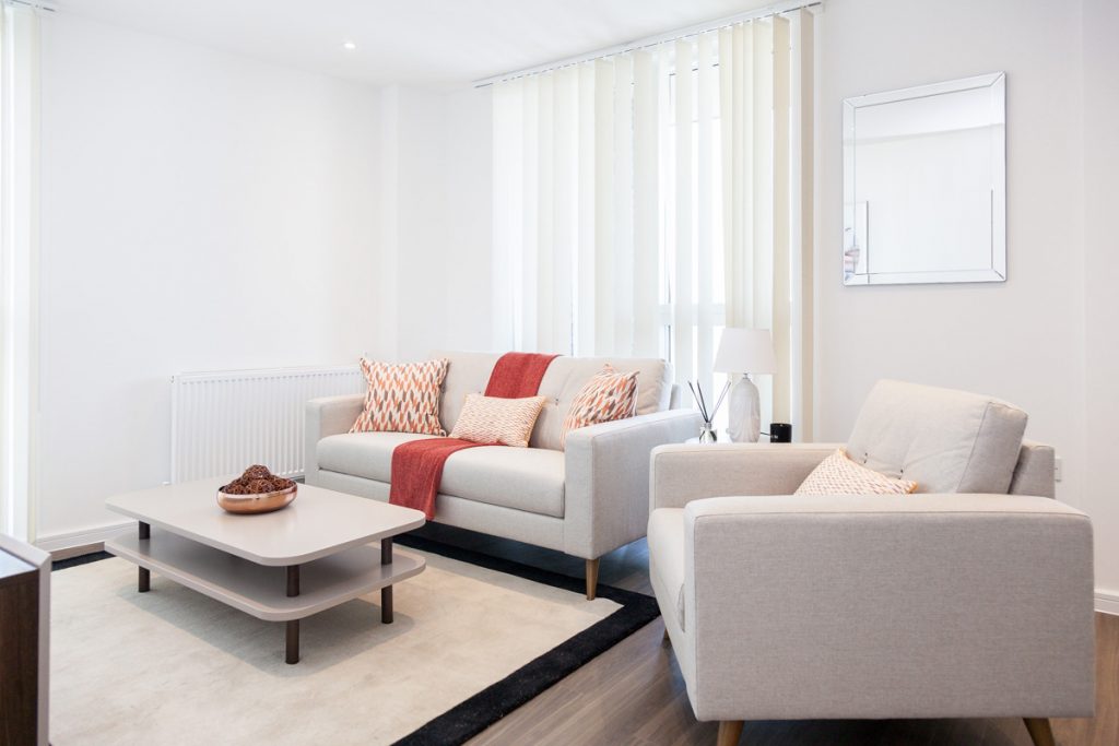 Gold range
Tonal harmony
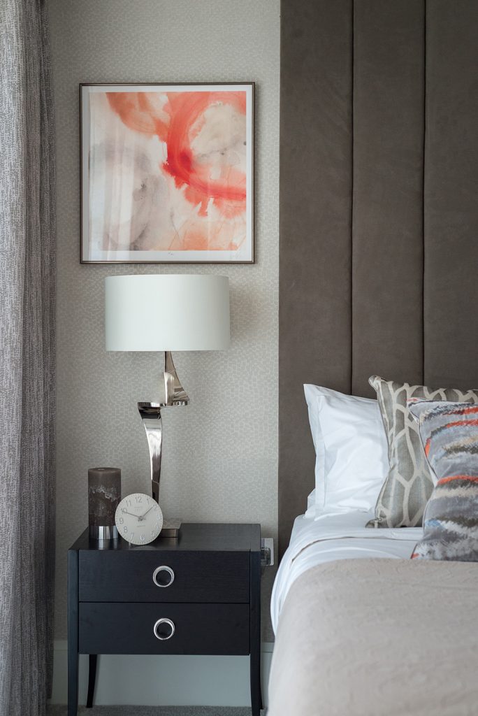
Alongside using the colour in splashes, the interior design team suggests picking some stronger colours that work in harmony with the Pantone. For example, Living Coral’s golden undertones mean that warm colours such as golds and yellows will work well with the colour. You can even create a ‘hot’ scheme with fiery reds, burnt oranges, flamingo pinks using Living Coral or go for a more muted, relaxed feel by pairing it with greys, fawns and purples as the interior design team has done for this project.
Bespoke interior design
Optimism and joyful pursuits
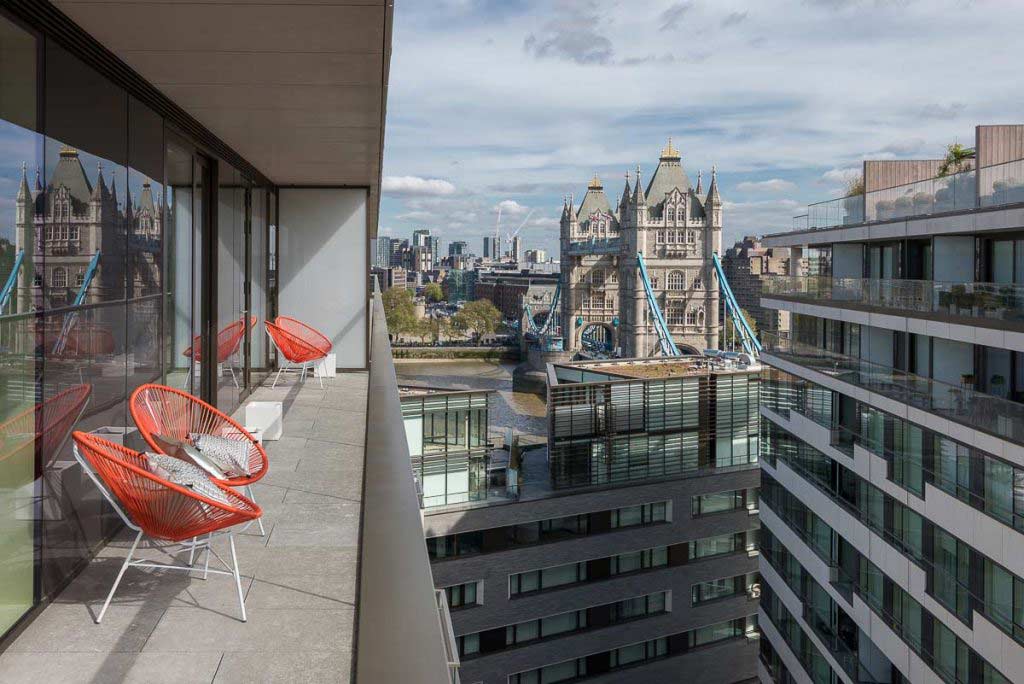
Pantone comments that Living Coral represents how our leisure time makes us happy and it is natural then to think about the coming summer. Our bespoke interior design service regularly includes outside space such as garden, balcony or terrace as they are an important place to unwind and relax. Living Coral’s tropical vibrancy is perfect for outdoor furniture or accessories, especially with an assortment of lush green plants. Our interior design team have sourced these bespoke garden chairs, perfect for relaxing in the sunshine against a backdrop of this development’s concrete greys.
Bespoke interior design
Smart thinking
As ever, homeowners are thinking of clever ways to incorporate trends without committing to a scheme that could look dated quickly and be costly to change. Our home interior design service is on the mark with design-led packages and decor themes that allow for small, low-cost changes that will make a big difference. Neutral schemes with a selection of stand-out items can make change, quick and easy. As the team has shown, using Pantone: Living Coral on objects d’art, one-off pieces of furniture, accessories and soft furnishings, such as cushions and throws is a simple yet effective update. This bespoke artwork was sourced by the interior design team, who also picked out Living Coral in the cushions on the bed. This upgraded Diamond furnishing package scheme celebrates the Pantone without making it difficult to change and that is key to enjoying a trend without being restricted by it.
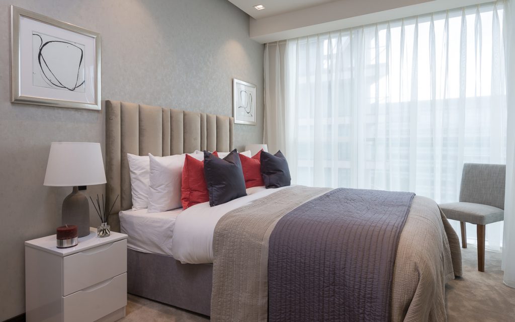
Upgraded Diamond range
If you would like to see how the interior design team celebrate this year’s Pantone of the Year in a bespoke scheme for your property, and what furnishing packages will complement the new look, them get in touch today.